The Part of App Store Localization Nobody Automates
Translating the marketing headline was never the expensive part.
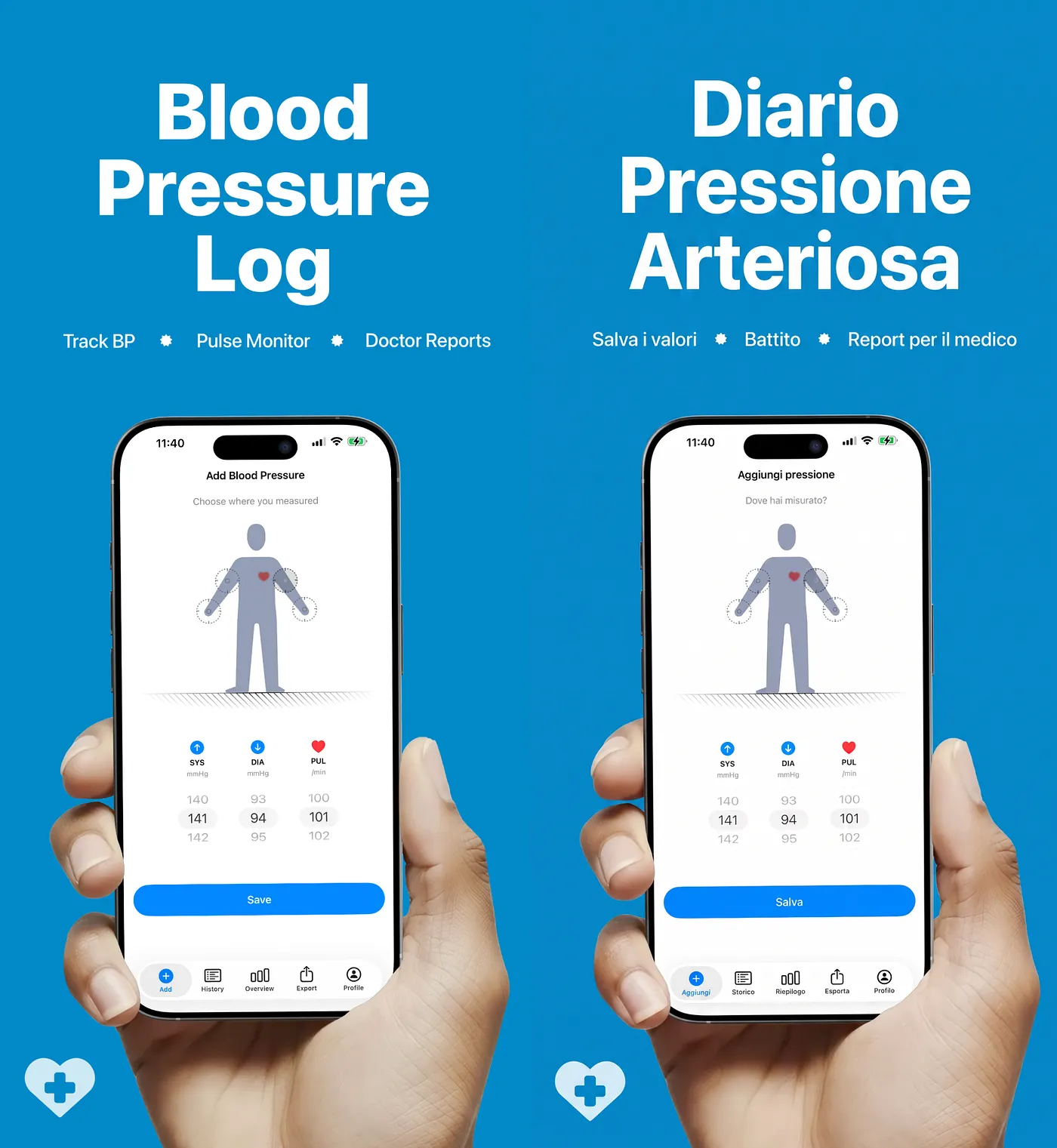
My Italian App Store screenshots show an Italian app I never once booted in Italian
Translating the marketing headline was never the expensive part.
Two App Store screenshots, side by side. The left one is English. The right one is Italian. Same layout, same illustration, same device frame.
Now zoom into the phone inside the Italian version. The tab bar is Italian. The buttons are Italian. The section headers and the sample content are Italian.
That screen has never existed. I never started a simulator in Italian. I never took a single new capture to make it. One prompt, one review, one word: approved.
The four seconds that decide it
Start with a person who is not you. Someone in Milan opens the App Store. They search in Italian, using the words they would say out loud. That alone is why localization matters: if your listing is not in their language, you are not in the results.
Say you got that part right. They find you. And then the only thing that happens is that they look at your screenshots.
Most of the people swipes the carousel. That carousel is your whole pitch, and it takes about four seconds.
So here is what they saw in my case. The headline spoke to them in Italian. Underneath it, the phone showed an app in English.
Something goes slightly wrong in a reader’s head at that point. Not a conscious thought. A small hesitation.
Is this app really in Italian, or did they only translate the store page?
Because that is a thing developers do, and users have been burned by it.
The frustrating part: my app is fully Italian. Every string. Shipped and live for a long time. My own screenshots were telling Italian users the opposite.
Two layers of text, two very different prices
So why does everyone not fix this? Because an App Store screenshot holds two layers of text, and they cost completely different amounts to change.
Layer one is the marketing headline. It lives in your design file. It is a string. You edit it and export.
Layer two is your app’s interface inside the phone mockup. Tab bars, nav titles, buttons, list rows, empty states, sample data. That is not a string. Those are baked pixels: a screen capture you took from a running build, at some point, in English.
This is the part that catches people out. Localizing your app does nothing to that PNG. My Italian strings ship with every release. The screenshot does not care. It was captured in English and it is frozen there.
The manual route is the one I used to walk. Switch the app to Italian. Start the simulator with the right device, the right OS version, the right sample data, the right screen state. Then walk through the app and capture every screen. Six of them, eight of them, whatever your carousel is. Then drop each capture into its mockup frame in the design file, rebuild every composition, write the Italian marketing copy above each one, and export the set.
That is most of a day. For one language.
Now do French, Spanish, Japanese. Six screens across ten languages is sixty captures and sixty re-compositions. Change one headline later and you are back in the design file for all ten.
That is not a translation problem. It is a production problem, and it sits in different tools on a different day from app localization. Which is exactly why it never got scheduled. The app already worked in Italian. It felt done.
What the existing tools fix, and what they leave
There are tools for this. Upload a screenshot, pick your languages, get a set back. They are good and I am not here to attack them.
But look at what changed. The headline is in ten languages. The phone is in English in all ten.
They solve layer one, which was already the cheap layer, and leave layer two exactly where it was. You still start the simulator. You still capture six screens per language. You still rebuild every composition.
They save you the copywriting. They do not save you the day.
That is the gap I built for. Not “translate my marketing text” that problem is handled. Translate the interface inside the mockup, so I never have to produce a localized capture at all.
The plan comes before the pixels
What I built is a Claude Skill. A skill is a folder you hand to the model: one file with the workflow, a folder of domain knowledge, a folder of plain Python scripts. Think of it as a recipe card plus the reference books plus the kitchen timer.
The design decision I would defend hardest: judgment goes to the model, rules go to code. Whether an Italian button label sounds like a real app is judgment. Whether the title is under thirty characters and the output PNG is pixel-identical to the source is a rule, and rules are scripts that pass or fail.
The input is the PNG that is live in App Store Connect right now. Not a Figma file. Not layered source. Not a fresh capture. The file I already shipped.
The model opens each screenshot and looks at it. Not OCR. The hard job is not reading the text, it is working out what kind of text each string is, because one image holds four kinds with four different rule sets. Marketing headline: translate freely. App interface text: product language, not marketing language. Sample content: translate it and localize what is inside it, so dates flip to day/month and decimals take a comma. Brand name: never touched.
This is where OCR falls down. It gives you a list of strings. It cannot tell a headline from a tab label, or your logo from a button. The categories are the whole job, and OCR throws them away.
Then, before any image is generated, the skill writes a plan. One table per screenshot: element, source text, Italian text, notes. Every tab, button, nav title, section header, empty state, placeholder, badge, timestamp. Then a consistency pass across all six screens, so one control never gets two different words.
That table is my review step. I put it next to my Italian strings file. If the app says Impostazioni, the screenshot says Impostazioni. Not a synonym. Not a nicer word.
What broke first
The image work did not work on the first try, and the rules that fix it all exist because of a specific failure.
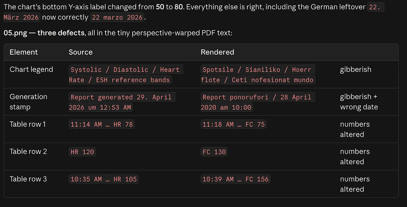
Interface text is small, dense, and surrounded by things that must not change. A headline sits on empty space. A tab label sits three pixels from an icon, inside a device frame, under a status bar. The model wants to help. Helping is the failure mode. Early runs came back with a redrawn icon and a tab label squeezed flat.
Five rules fixed it:
- Text-only edit. Device frames, bezels, status bars, icons and illustrations are reproduced pixel for pixel.
- No horizontal squeezing. Italian words are longer and the model’s instinct is to condense the type.
- A four percent edge margin. Italian accents sit on the last character, so è, à and ù are the first things to get clipped.
- Shrink the font, never expand the box. A tab bar cannot grow.
- Composition lock. Mask out the text and the localized image has to be interchangeable with the source.
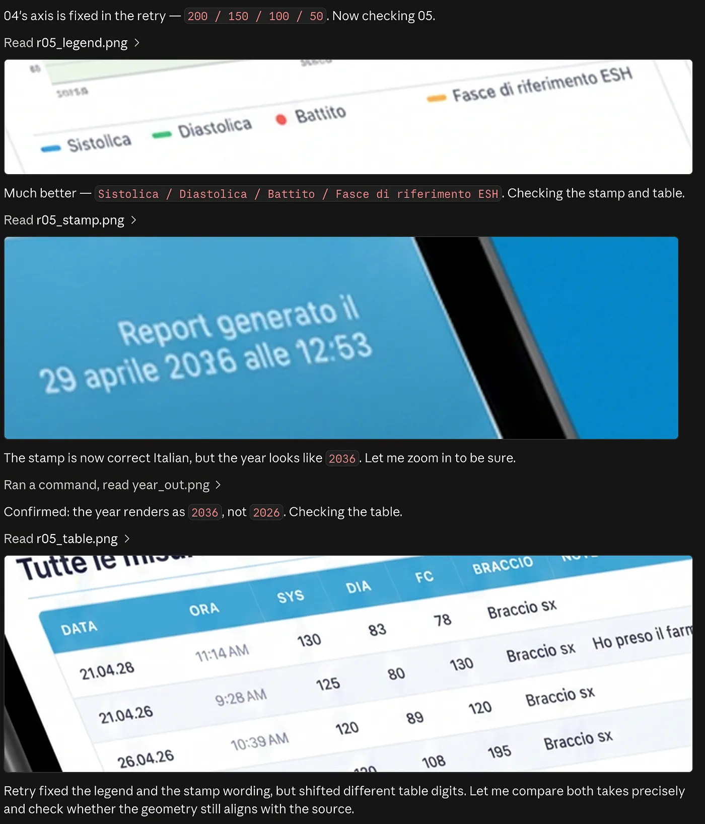
The last step is code, not judgment. Dimensions pixel-identical, because Apple requires the exact device resolution per slot and a resized image is a rejected submission. Every planned element accounted for. Brand name intact. Every metadata field inside its limit.
The insight: a screenshot is a promise
A screenshot is a promise about the interface someone is about to download. I already made that promise when I localized the app. The screenshot was breaking it.
That reframing is what changed my priorities. I had been treating store assets as marketing, which is someone else’s job on some other day. They are not. They are the last part of the product a user sees before they decide, and they are the only part I was shipping in the wrong language.
What it costs, and where it still needs a person
The engine is Wavespeed running Google’s Nano Banana Pro. About fourteen cents per screenshot. Sixty generations across ten languages is around nine dollars plus reruns. Roughly one in eight screens needs a rerun, usually a small interface label, because generative editing is not deterministic.
For a company, the number that matters is the other one. Sixty manual captures and sixty re-compositions is most of a designer week per release cycle, and it repeats every time a headline changes. That is the cost that made the work never get scheduled anywhere, not the nine dollars.
Four limits I would want to know if I were reading this.
- Feed it your real strings. The skill writes good Italian, but it does not know your Localizable.strings unless you hand over the glossary. Otherwise you create a subtler version of the same mismatch.
- It is not autonomous, and I do not want it to be. Nothing is generated until I type “approved”. Type it without reading the review and you have built a machine that ships bad Italian quickly.
- You still need someone who reads the language. The skill runs an automated native-speaker review that scores every Italian element from one to five and explains, in English, what is wrong. That is enough for me to make a real decision. For your highest-revenue locale, have a human native speaker read it once.
- And it does not carry over unchanged to a larger company. A team with a design system, legal review and brand guidelines has approval steps I do not have, and the glossary has to come from whoever owns the terminology, not from the person running the tool.
Back to Milan
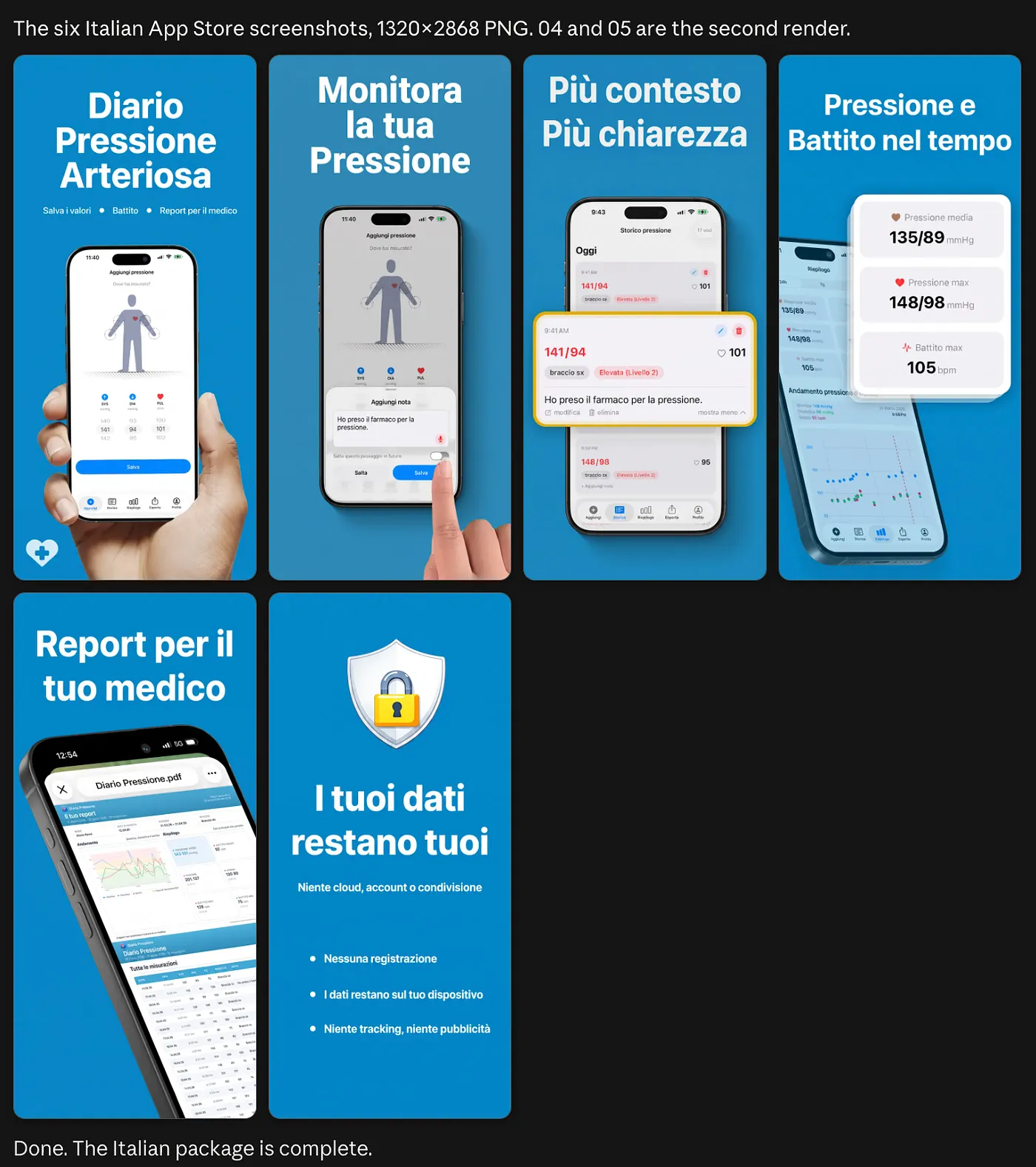
Someone opens the App Store in Milan, searches in Italian, and swipes four screenshots. Either everything they see is in their language, or something quietly does not add up.
Getting to the first version used to mean a simulator session, six captures and an afternoon in Figma, per language. Which is why I did not do it, even though the app was already Italian.
The real change is not speed. It is that screenshot localization stopped being a separate project. It is a task now, and tasks get done.